Another six images, in colour
Colour wedding photography. When is colour better? Is it ever better? I made my case for monochrome in documentary wedding photography in the last post. But I also challenged myself, saying I would post some colour images, with this…“For colour to work, the colour needs to be really good. Punchy and vibrant but also relevant. It needs to be fundamental to the image. Otherwise it can look like a ‘snapshot’….” So, same criteria – six images from this year, this time in colour. This proved harder to do. In a way…
I recently saw a comment online in which an American wedding photographer queried why UK photographers seemed to shoot in black and white so much? Well the UK weather for one. This isn’t California or Tuscany. Sure we get the glowing evening light sometimes – which for UK weddings usually means most of the wedding is by now inside, everyone eating their chicken dishes and missing the ‘golden hour’. You do see some UK photographers ramping up the saturation levels in Photoshop, mimicking the work of well known West Coast wedding photographers. Less enhancing the light there, more forcing the colour to stand out and people tend to look orange in the images as a result. Fine if you want that look. It’s different to the faded 1970’s kodachrome look. It’s not documentary. Where does colour fit in, does it help or hinder the storytelling?
So, to the images. Okay, the first image is easy, this one had to be in colour. But the others…well, maybe? Let me know what you think? I’ve tried to steer away from the obvious images for some of this selection. An exercise for myself to justify my preference – colour or B&W. I’m not sure I chose the right ones but at the end of the post are the B&W versions. So this post is to provoke debate. Which works best?

Nikon D3S, AF-S 50mm f1.4 lens, 1/250th @ f2.0 1250ISO
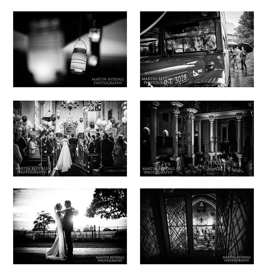
Wedding lanterns hanging in front of the sun that is dipping behind the surrounding hills at River Cottage. A wedding in May and one of my favourites of the year. Simple image. Simple (fast ) lens. Underexpose it a bit and imagine you are shooting on Velvia film ( well, not at 1250iso to be honest ). Can only really work in colour because the colour here is key. The warm saturated colour of the glowing lanterns is offset against the diminishing sunset and the cooler sky of night above. Warm in the foreground, cool in the background. A use of colour that predates photography and known by every painter in history ( until you get to the Hirst dots maybe ). Thrown out of focus by the f2.0 aperture, you are just left with the glow of the lanterns in front and behind. For me this is also a detail shot that has meaning. It helps tell the story rather than just look like a catalogue shot of expensive details for brides-to-be on a wedding blog. Colour wedding photography is central to that.

Nikon D3S, AF-S 35mm f1.4 lens, 1/200th @ f2.8 900ISO
This one is not so obvious. Another one from May, just a week after the glowing lanterns in Devon. This time in Kent and the rain was incredibly heavy as everyone left the country church. The Nikon D3S didn’t miss a beat. Wedding guests dashed for the red Routemaster bus waiting by the churchyard. Does showing the bus in colour give the image more information or distract? Compositionally the eye should be led from left to right, to the ushers braving the rain at the back of the bus, which is also the point of focus. The camera is tilted – this is a big no-no for some wedding photographers who clearly don’t ever look at the winning images in the World Press Photo competition. This isn’t a 45 degree angle shot of someone walking towards the camera, but a gentle nudge to help the composition. Is colour helping or hindering? Maybe B&W for me.

Nikon D3S, AF-S 24mm f1.4 lens, 1/250th @ f2.2 1250ISO
Had to be colour, no? The bride and groom walk down the aisle as the ceremony begins, at the Swedish church in London. Simple but inspired decorations – colourful balloons tied to the pews. This shot is also helped by one of those ‘happy accidents’. The flash from a wedding guest’s camera has gone off at the same time as my shutter tripped. Impressive synchronisation given I was shooting at 1/250th of a second. But as this flash is further in the shot, behind the couple – see their shadows cast across the aisle – it acts as a perfect directional light, to give more depth and dimension to the image. Directional light is the available light photographer’s friend.

Nikon D3S, AF-S 35mm f1.4 lens, 1/200th @ f2.0 1100ISO
The wedding reception party at Christ Church in Spitalfields, London. A fantastic, vast space for a wedding reception inside one of Hawksmoor’s eighteenth century churches. Taken from the top balcony at the end of my coverage. An image to end the storytelling of the day with. The colourful lighting had to shown off, but really makes this shot is the white light picking out the bride and her friends. ( Ideally it would have been the only white light but some is on the window arches ). Usually the wedding photographer’s nightmare is red or mauve lighting flooding a venue ( not that DJ’s or wedding planners seem to care). Digital sensors hate this light. It messes up countless shots, although not as many as those red and green laser dots that wedding DJ’s think are so ‘cool’. The sensor just loses information as it cannot record details in this light. But here, a distance away, the coloured light can be recorded to show the ambience of the evening. That white light is crucial though. ( DJ’s – here’s the thing. White light is classy, a spot or two on the bride and groom as they dance is classy, romantic, photogenic – red or green dots or coloured swirly patterns are not! Why are people who are there for the audio also in charge of the light – 99% have no clue! )

Nikon D4, AF-S 50mm f1.4 lens, 1/2000th @ f2.0 100ISO
Now I’ve included this one because this is different to the others. This isn’t about full colour saturation, the image is almost monochrome. But it isn’t. The colour, of the fading October sunset, is subtle, faint, ephemeral. Does this image work in black and white? Of course it does. But I like the colour. That pale ‘winter’ light casting a sheen on the roadway, peeking around the couple. A summer version would be a burst of golden light, but maybe this has more subtelty? This image is also a good illustration of something I try to tell every couple. Light. Light is key. Seeing light and using light is what makes good photographs…good photographers. It’s what you pay the extra for frankly. Light waits for no-one. It doesn’t care about your schedule. It doesn’t care that the main course has just been served. At this wedding at Blake Hall ( first time there for me, top venue! ) we had bright sunshine as everyone went into the barn for the meal. The skies then clouded over, it got dark and cold ( as I sat in my car watching the sky). Then suddenly the light burst through, late in the evening, as it often does just before sunset. I dashed inside and asked the couple to come out. ( I think documentary wedding photography coverage should include portraits of the couple together ). Even then it was fading away quickly – time only for a handful of shots. A guess of ‘just stand there!”.

Nikon D4, AF-S 16-35mm f4.0 lens, 1/80th @ f4.0 6400ISO
An image from a wedding ceremony at St Leonards-Mayfield school chapel in Sussex. A rare outing for the ultra wide zoom lens ( still very sharp ). Taken from a room overlooking the chapel – once the Great Hall of the Bishop’s Palace. It’s an amazing space for a wedding ceremony and I like this vantage point for a clear shot of the ceremony. But I also liked this shot, standing back from the window and the way the window tracery was casting a pattern over the walls. Does this work in B&W…yes. But, the warmth of the light only comes through in colour and for me that wins. Warmth was in the room, visually and emotionally. Even the priest was an old schoolfriend of the groom’s. Does colour help convey this warmth?
So, that was colour wedding photography, how about these images in black and white?
What do you prefer? Colour or B&W?
Really interesting, insightful read, Martin – with fantastic images, too, of course! I definitely find that some weddings just lend themselves to more black and white images, whilst some work better in colour; they’re all so different. Great reading your thoughts and seeing both versions – top idea.
A fascinating read. It’s really good to hear your thought processes behind selecting colour over black and white. Thanks for sharing.
Really great blog post. I love a great colour photograph with lots of colour burn in. That said – black and white can really focus in on an expression or a sense of movement which can be lovely as well!
Very interesting read and great pictures. Thanks for posting.